|
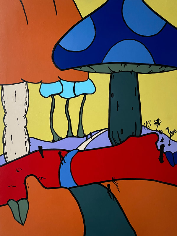
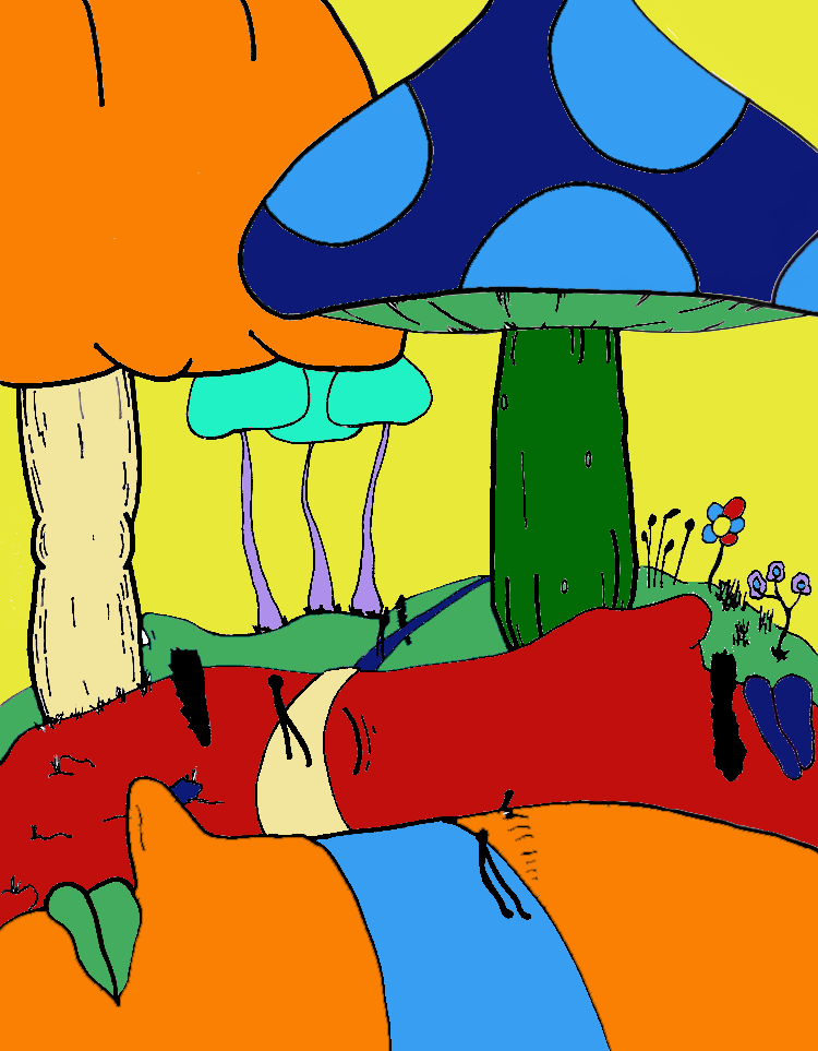
AboveSpray Paint on MDF Board
45cm x 60cm December 2020 This piece is inspired by a path of changing perspective. Embracing new perspectives and being open to the changing and flowing world around us can allow the environment around us to transform into something beautiful and enticing. |
Planning
Inspiration
|
My main inspiration for this piece was the artist Peter Max. I really love Peter Max and his etchings as well as the colorful and dreamy landscapes he creates. I wanted to capture some of the colors and subject of his landscapes and combine them with the outlined, sectioned style of his etchings. I wanted my piece to be a very colorful, dreamland, psychedelic, graphic landscape with a solid flat colors in a heavily outlined design.
|
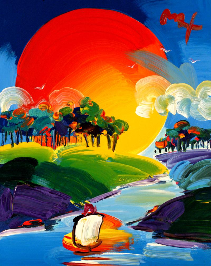
Without Borders Ver. III by Peter Max
|
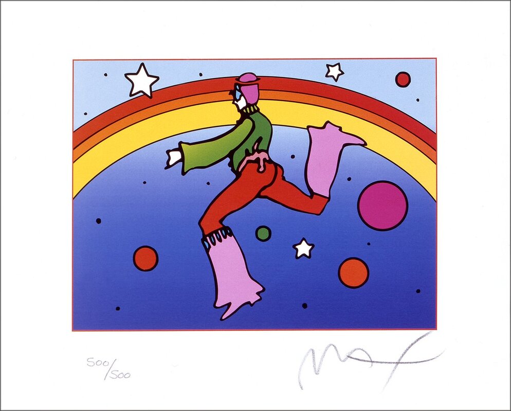
Cosmic Jumper Detail II by Peter Max
|
Planning Sketches
|
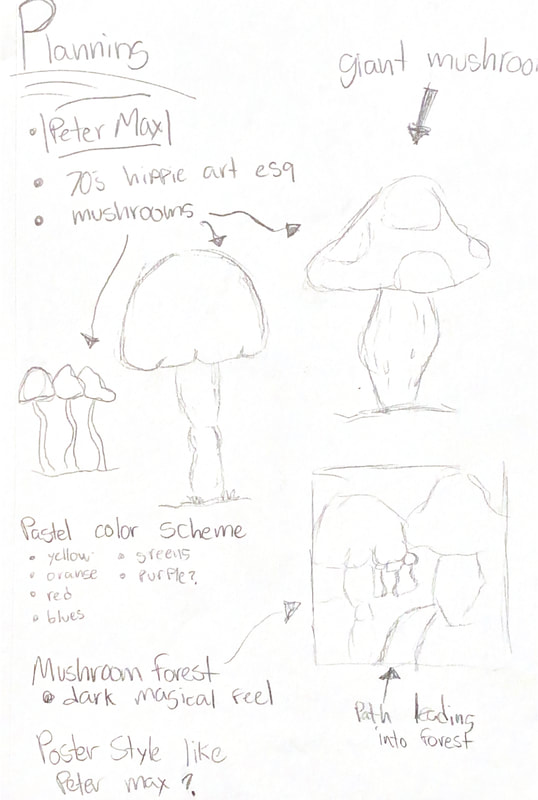
When planning my piece I had a vision for a big forest of giant mushrooms and a path leading into this magical environment. I wanted a lot of differentiation in the mushrooms and I wanted the scale of them to be obvious. I knew I wanted to use a pastel color scheme and have lots of 70's hippie inspired colors. I originally had the idea to make it a poster that I could turn into a poster pasting piece much like a lot of Peter Max's work during the hippie movement.
I was heavily inspired by the rich and solid colors that were often prevalent in the hippie movement as well as Peter Max's work. I did not quite know at first how to achieve such a rich solid color but began to ideate and reached spray paint as a focus point. I have used spray paint in some of my personal art endeavors but I wanted to challenge myself to make a clean intricate piece using the medium. |
Experimentation
|
I used MDF board as my canvas to create a smooth and rigid surface to spray onto. I wanted the piece to be solid and canvas did not provide the rigidity I wanted with the piece. I bought all of my colors and the MDF board but I suspected I would need to heavily prime the MDF board. The MDF board is somewhat absorbent and also dilutes the color so its not as rich and solid. I started the process by priming the MDF board in white spray paint for 5 coats.
I started this project outdoors because of the fumes spray paint creates. However after beginning priming outdoors, I noticed that the wind would blow dust and particles into the wet paint and it would create an uneven surface. I move the project into my garage and left the door half closed after this discovery. |
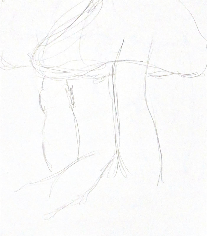
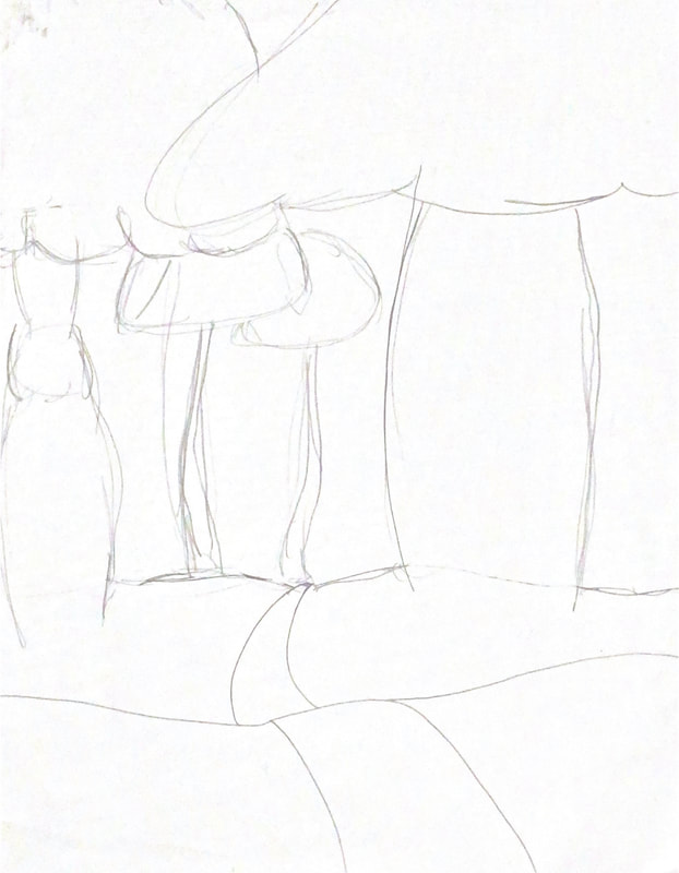
I began my experimentation trying to map out how I wanted to path to lead into the mushroom forest. There was a certain distance I wanted to create between where the path began in the foreground and where it cut off in the forest. I started with several crude sketches with different positioning's of the path until I finally reached the sketch to the far right. The hills that path travels over turned into faces during my sketching and ideating process which contributed to the dreamy feel I wanted to further develop and also helped give scale to the piece.
|
|
|
Process
|
|
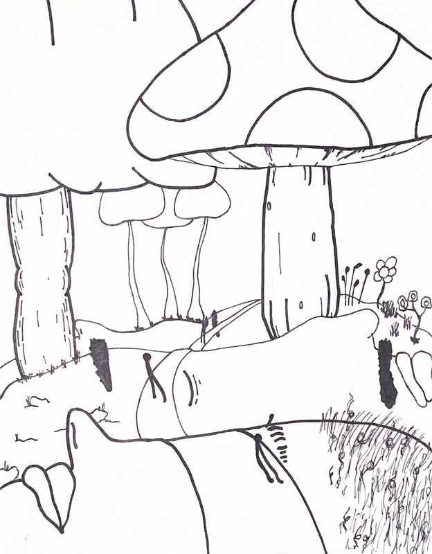
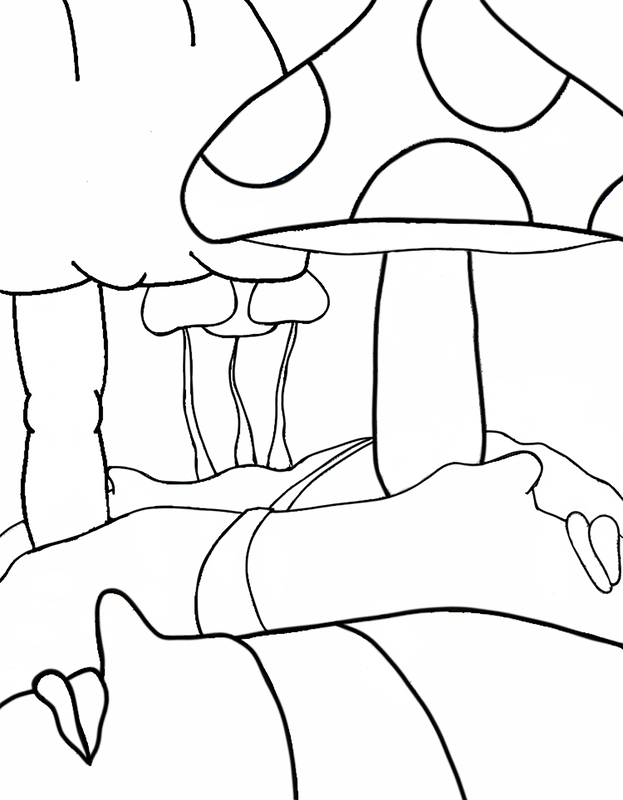
The first step I took was bringing the rough sketch above into Adobe sketchbook so I could smooth out the shapes and lines and solidify the design. This also gave me the opportunity to use the fill tool and experiment with the placement of the colors of spray paint I had purchased. This was extremely helpful and helped me see how the piece would feel with certain color layouts, which I further ended up changing during the painting process after I had some visualization. I knew there were going to be some details like the eyes, facial hair, and flowers that I would have to add in after I had spray painted. I took the outline and removed everything I would add in post, to leave myself with only outlines of where different colors would go. This outline on the right was the one I transferred onto my MDF board in the next step.
|
|
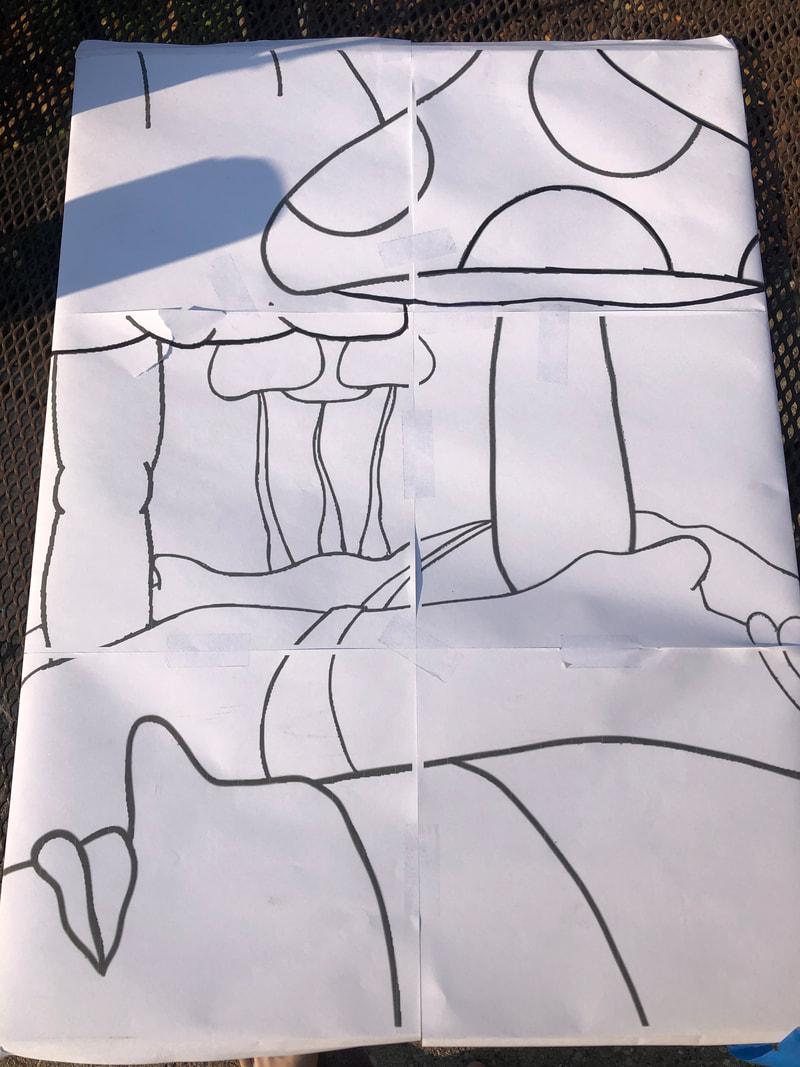
For the next phase of the process, I took my sketch and I blew it up to full scale size. I then printed the outline in several sections of printer paper and taped them together to place over the MDF board. I then had the full size outline on the primed MDF board ready for transferring.
|
|
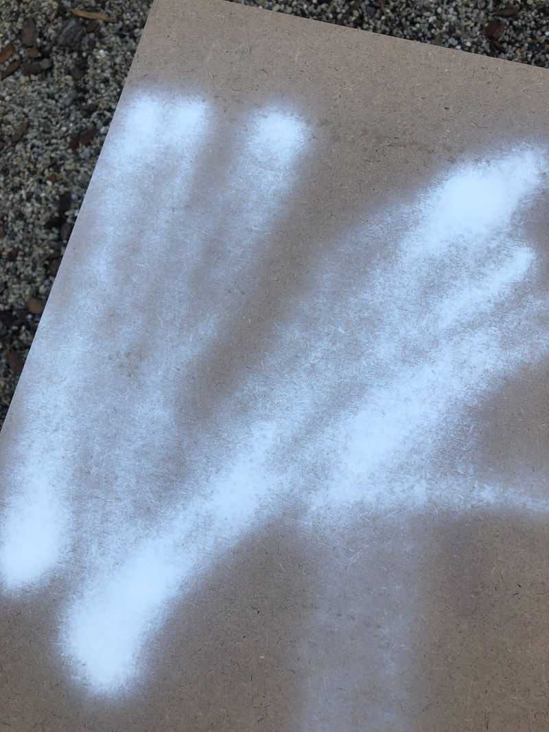
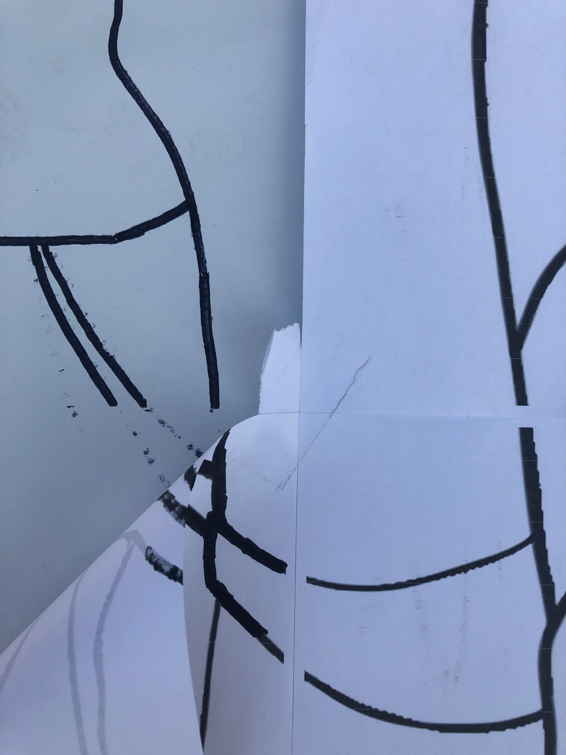
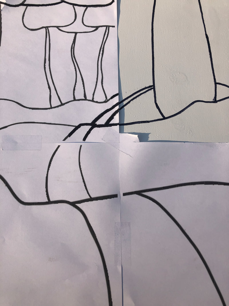
To transfer my design from the paper onto the MDF board, I went over every line on the design with a thick sharpie. I drew over several times and the sharpie bled through the printer paper on to the MDF board in the correct orientation as you can see in the left picture. The sharpie that bled through was not very solid of a line so I went back over the crude lines with the sharpie again to transfer the design solidly onto the MDF board as you can see in the right picture.
|
|
|
|
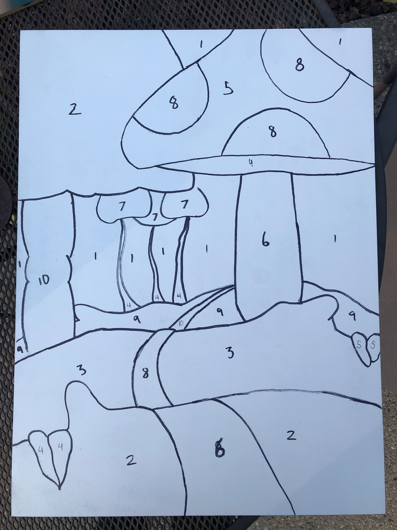
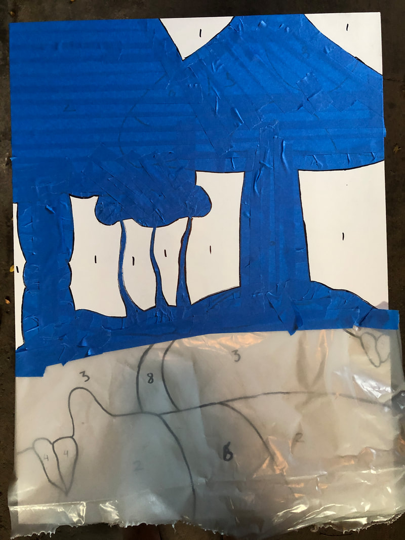
For the next step, I took the colored outline and my sharpie and labelled every color in a Paint By Numbers style so that I knew what color needed to go onto each section. I also numbered the colors in the order I wanted to apply them so that I could do it in the way I viewed most efficient
|
|
|
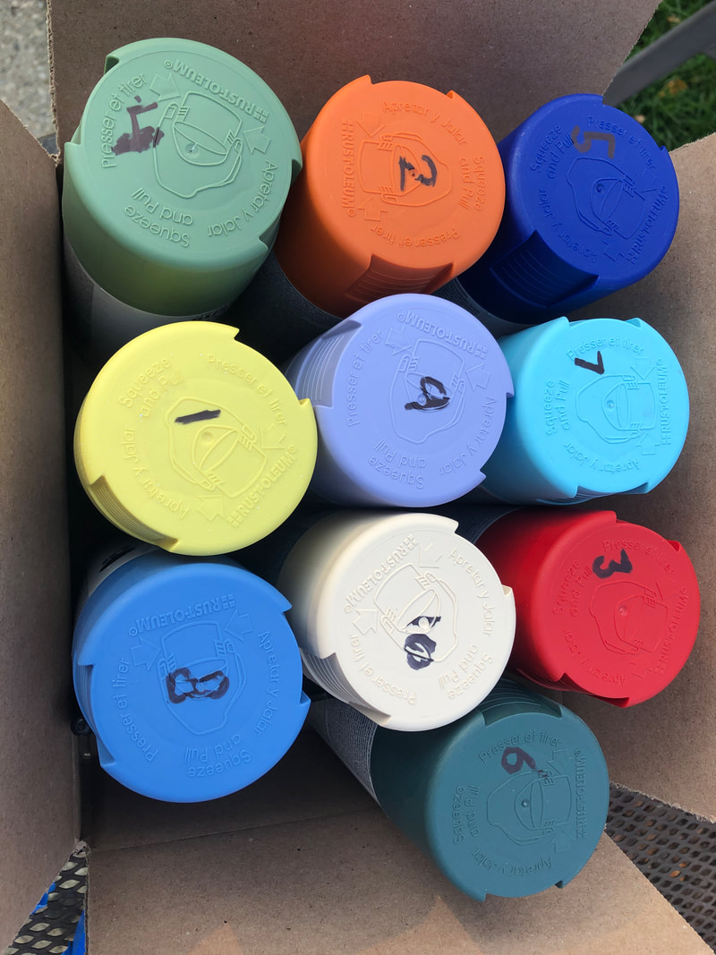
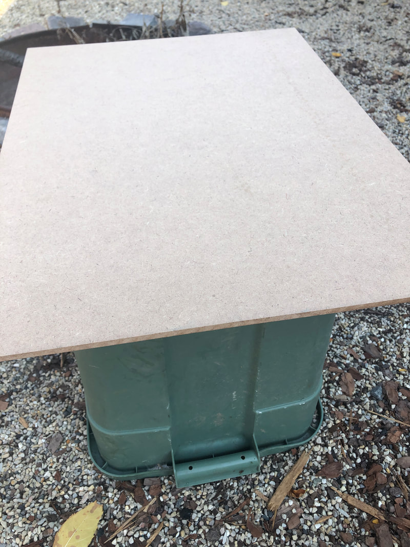
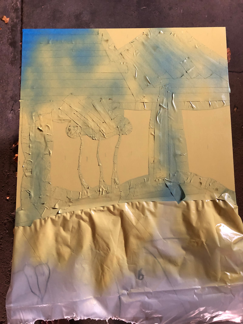
I then began my painting process. I elevated the MDF board on an upside down bucket so that nothing was touching the painting or the edges as you can see in the top right. I then started with color and section number 1. I took masking tape and sheets of plastic to cover every part of the painting except for the number 1 sections. The final product was the bottom left picture. After that I proceeded to spray three coats of the 1st color shown in the bottom right. After the painting was done and dry, I removed the masking tape and plastic and repeated the same process for the next 9 colors. The lighter colors needed more coats then the darker colors in order to cover up the sharpie outline.
|
|
|
|
After all of the colors had been masked off and completed, I went in with a black acrylic paint marker to solidify the outlines between the colors and also add the facial hair, mushroom details, and flowers. The paint marker also took several layers to create a solid smooth line. After the paint marker I went over the entire piece with a matte clear coat to achieve the matte look with my colors and create a uniform finish.
Reflection
Overall, I am very happy with the piece I created. I had a vision for it and I feel it was executed well and translated perfectly onto paper. In the future, I will improve upon the method I used to mask and paint separate sections. The process was very time consuming and tedious and I feel there is a way I can improve upon the process to make it more efficient and simple.
|
Similarities
- Both pieces use heavy outlines to create the subject matter - Both pieces use rich, solid color in sections to give form to the piece - Both pieces depict a fantasy, dreamlike scene Differences - Peter Max's piece uses gradients and grains and mine is completely solid - My piece uses much more fine detail and small elements to contribute to the piece - His piece includes separation between sections and is more open while mine is a solid scene |
|
ACT Responses
Clearly explain how you are able to identify the cause effect relationship between your inspiration and its effect on your artwork?
The cause and effect relationship between my work and the inspiration is prevalent in the color scheme and outline style of the pieces.
What is the overall approach the author has regarding the topic of your inspiration?
The author used the approach of fantasy and dream like scenes for inspirations.
What kind of generalizations and conclusions have you discovered about people, ideas, culture, etc. while you researched your inspiration?
I made generalizations about how certain mediums could create the effect I wanted and provide rich solid colors.
What is the central idea or theme around your inspirational research?
The central idea and theme around my research was spiritual pathways and the changing perceptions of our world as we walk along them.
What kind of inferences did you make while reading your research?
I made inferences into the color schemes of the hippie movement in the 70's and inferences into prevalent artists in the movement.
Bibliography
Joe. “Peter Max.” Park West Gallery, Park West Gallery, 26 Mar. 2020, www.parkwestgallery.com/artist/peter-max/.
Max, Peter. Peter Max Store. petermax.com/.
Max, Peter. Peter Max Store. petermax.com/.
